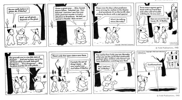
Crockett Johnson was born David Johnson Leisk in New York 1906. Over the years his name morphed into the nom de plume “Crockett Johnson” but close friends still called him Dave. Johnson’s father was a Scots immigrant who worked as a bookkeeper and his mother was an immigrant from Germany. Johnson’s father died in 1925 during his freshman year at Cooper Union and the young man dropped out of school to support his mother and sister. He worked at a number of jobs and may have played a little semi-pro football for the Flushing Packers. Johnson’s first graphics job was as assistant art editor at Macy’s. He was probably hired for the artwork he had done in high school, such as for the yearbook. He was fired for not wearing the stiff celluloid collar required of Macy’s employees.

Johnson in front of one of his paintings, 1969, via the Crockett Johnson home page
After several other brief employments, Johnson wound up in 1927 as art editor for Aviation magazine. He was successful at this job and began taking courses in typography and design. One notable teacher was Frederic Goudy, designer of the font that bears his name. Goudy’s credo was simplicity — eliminate “unneccessary lines and parts”. This seems to have had a major effect on Johnson’s work who described his own style as “simplified, almost diagrammatic, for clear storytelling, avoiding all arbitrary decoration”. [from Phillip Nel, Crockett Johnson and Ruth Krauss, see end of post].
When McGraw took over Aviation in 1928, Johnson moved up to art editor of about six different magazines. This golden period lasted only a few months. The crash of 1929 left Johnson with a much reduced salary, though he still had a job.
Johnson had left-wing political leanings and hung out with a radical crowd. His first cartoon appeared in New Masses in 1934 and soon cartooning became his only work. Johnson turned out cartoons for New Masses until 1940 and then began a run of The Little Man with the Eyes for Collier’s. In 1942 Johnson produced his first Barnaby strip for PM, a publication that also carried work by Walt Kelly, Coulton Waugh, and Theodore Geisel (Dr. Seuss).

“Little Man with the Eyes” strip via philnel.com
PM had a miniscule circulation composed mainly of New York lefties and intellectuals but Johnson did get syndication for Barnaby and the strip was read across the country. Dorothy Parker wrote a glowing review ( “…Barnaby and his friends and oppressors are the most important additions to American Arts and Letters in Lord knows how many years.” ) and other critics agreed that Barnaby was a great comic strip.
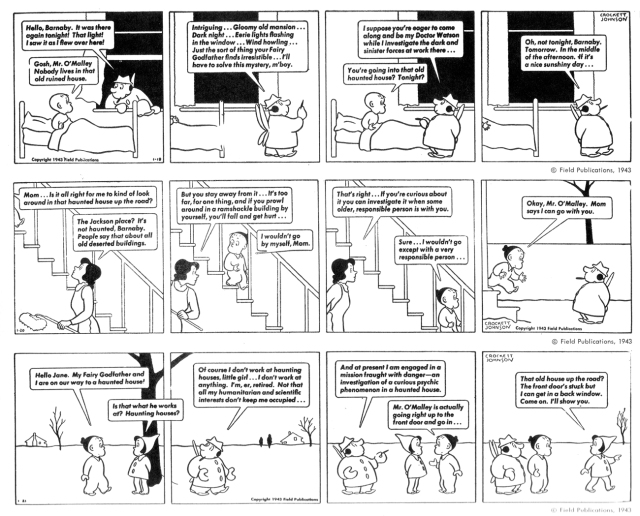
Barnaby is a young boy who has a fairy godfather, Mister O’Malley, a member of the Elves, Leprechauns, Gnomes, and Little Men’s Chowder & Marching Society. No adults can see O’Malley and he is thought by them to be just a creation of Barnaby’s imagination. Mister O’Malley is a bit of a fraud, always promising magic that he never quite manages to pull off. Barnaby is his straight man. Over time, the strip added characters like Barnaby’s friend Jane, Gus the Ghost, and Gorgon the (sometimes) Talking Dog. Over the years, Barnaby has been adapted into a stage play, a children’s theatre production, a radio show, and a live-action television special in 1959 with Ron Howard playing Barnaby.
Next two days. You now have a week of Barnaby. [scanned from The Smithsonian Collection of Newspaper Comics]
By 1946, Johnson grew tired of coming up with gags five days a week and tried to turn the strip over to other people but could not let go. He micromanaged to the point where he might as well have kept on doing it all and finally, in early 1952, Johnson wrapped the strip up. By this time he was into the second leg of his career, writing and illustrating children’s books.
Johnson had married in 1930 but that union unravelled over the next decade and in 1943, he married again to children’s book writer, Ruth Krauss. In 1945, Johnson illustrated Krauss’ The Carrot Seed , and a few other works including this deprecated classic, but often she worked with other illustrators.
Krauss had recorded a number of poetic utterances from children and wanted to put them together into a book. In 1952, Maurice Sendak, who was just starting out in the field, began working on the project. Soon, he was living at the Johnson/Krauss home while working on the new book, A Hole is to Dig. Krauss and Sendak’s discussions sometimes became agitated. Sendak recalled:I remember the porch table covered with a million (it seems) bits of Krauss words and thinkings, encircled by my little scratchy, dumpy doodles. Ruth and I would arrange and rearrange and paste and unpaste and Ruth would sing and Ruth would holler and I’d quail and sulk and Dave would referee. His name should be on all our books, for the technical savvy and cool consideration he brought to them. There was an impressive silence about Dave (he was the most giant of all!), and after Ruth had gone to bed I’d hang around with him, hoping he’d open up and waiting for my weekly reading list.
Krauss insisted on Sendak getting a good royalty instead of a small fee for illustrating A Hole is to Dig and, when the book became a best-seller, Sendak was able to quit his day job and concentrate full-time on children’s books. He illustrated a number of other projects for Krauss, with Johnson providing lay-out and design assistance.
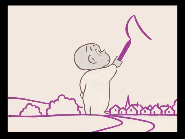
Crockett Johnson was also writing and illustrating his own children’s books. In 1955, he created Harold and the Purple Crayon, which was an immediate success. Weston Woods bought an adaptation of Harold for their series of animated children’s books that Johnson hated. Weston then got Gene Deitch to adapt a sequel, A Picture for Harold’s Room. Deitch discovered one reason Johnson disliked the Purple Crayon adaptation: the film violated Johnson’s use of “perpetual profile”:
Johnson simply shifted the position of Harold’s ear and eye, which in conjunction with his body position made you believe you were seeing his head from three-quarter-front, or three-quarter rear as well as from the side. It was Crockett Johnson’s version of the illusion of shifting of Mickey Mouse’s ears as his head turned!
Now thinking he had the magic formula for interpreting Johnson’s work, Deitch sent storyboards to Johnson for approval and received a one-line postcard, “This is the worst thing I’ve ever seen!” Deitch was shocked but went back to the drawing board. The problem was that Deitch had used close-ups, medium shots, different camera angles, and all the other paraphernalia available to animators but Johnson had drawn the story from a single viewpoint. Harold moves along the wall, always remaining the same size, as he draws a single continuous picture that includes all kinds of outsize elements. In order to correctly adapt the book, Deitch had to do the complete picture as background then shoot the action in reverse, scratching off the background to show the drawing as Harold draws it. It was a massive undertaking but it won Johnson’s approval as being the first filmed version of his work that was true to his concept. Deitch did one more adaptation of a Harold book, then decided not to do any more — it was too difficult to copy Johnson’s simplicity.
Around 1965, Crockett Johnson entered the third part of his career: he began painting non-representational works that illustrated mathematical principles. Johnson had become interested in mathematics the way that amateurs become wrapped up in any number of disciplines. Sometimes these amateurs prove nuisances, cranks with half-baked theories, but Johnson actually published a few papers in mathematical journals — for instance, “The Geometrical Nature of √π” in The Mathematical Gazette. More than that, Johnson illustrated his concepts with paintings.
Many of these paintings are now in the National Museum of American History at the Smithsonian and there are articles about them (with explanations and diagrams) here, here, and here. Incidentally, before mathematicians weigh in, Johnson never claimed to discover the square root of pi, which is an infinite series of numbers, but said his work showed the limits of allowable values. It is interesting to think of what he would have painted if he were aware of fractal mathematics which was still in its infancy at the time.
Johnson also looked at the ancient problem of Squaring the Circle and did a few paintings around that notion as well. Whether you know anything about math or not, these are interesting paintings and might be considered alongside the work of other artists who tried to embody mathematical concepts in their work, such as Kandinsky and Palazuelo.
In 1973, when Crockett Johnson was visiting Syracuse, Greece, he sat in an outdoor cafe, rearranging toothpicks at his table. Turning his menu and wine list so that they formed the two equal sides of an isosceles triangle, he placed the toothpicks in a criss-cross pattern across the space in between these two sides (figure 1). Johnson then hypothesized that the angle where the menu and wine list intersected would be 180/7 degrees (“Stroud studies…” 7). His supposition was correct. So what? Well, as Professor J. B. Stroud has shown, this discovery permitted Johnson to “construct a regular seven-sided figure using a compass and strai[gh]tedge with only one mark on it.” Stroud, the former chair of Davidson College’s Math Department, adds, “As far as I know, nobody thought of trying this until Crockett Johnson. [from Crockett Johnson homepage]
Two years later, Crockett Johnson died from lung cancer. He had been a cigarette smoker from youth. Ruth Strauss lived another twenty years. Maurice Sendak died recently. These three artists left an impressive body of work. Their lives were linked. Reading Sendak’s account of the fuss and bother over the simple words and drawings in A Hole Is to Dig should say something about the difficulties in simplicity and eliminating “arbitrary decoration”.
Notes:
Phillip Nel has done most of the research cited above. He maintains the Crockett Johnson page, and also has cited much information on his own blog, Phil Nel, which also has much other good stuff
and see his article in Comic Art on Johnson.
Nel has written Crockett Johnson and Ruth Krauss: How an Unlikely Couple Found Love, Dodged the FBI, and Transformed Children’s Literature, which can be pre-ordered now and should be in bookstores next month. This post did not go into the troubles of American lefties in the 1950s, but if you are interested, I strongly recommend Nel’s book.
Fantagraphics is re-printing all of Barnaby beginning this December.


Wonderful post. I was aware of Johnson’s work in children’s books, but not aware of those amazing geometric paintings. I wonder if his use of color in these works is also linked to mathematical theory?
I don’t think so, but then I’m no mathematician.
[…] Crockett Johnson: The Slippery Slope from Comics to Fine Art: https://shrineodreams.wordpress.com/2012/08/21/crockett-johnson-the-slippery-slope-from-comics-to-fi… […]